
12 Warm Neutral Color Palettes for Cozy Small Apartments
Most small apartment advice tells you to paint everything white and keep things sparse. That advice gets the size part right but misses the style part entirely. Warm neutral color palettes are a better answer: they make a 400-square-foot space feel like it was decorated with real intention. Here are 12 palettes you can actually use in a rental without a design degree or a big budget.
Why Warm Neutrals Work So Well in Small Spaces
Cool neutrals like bright white, icy gray, and stark greige read as clean but can feel clinical in a small apartment. Warm neutrals shift the mood. Cream, sand, terracotta, blush, and amber all reflect light in a way that feels softer and more human. They pair naturally with the materials renters already tend to own: wood furniture, jute rugs, linen curtains, and wicker baskets.
There is also a practical reason. Warm tones mask the imperfections that come with rental apartments: scuffed floors, off-white walls with a yellow cast, and mismatched wood tones. A warm neutral palette works with those quirks instead of fighting them. Layering several shades within the same warm family creates depth without adding visual clutter, which is exactly what a small apartment needs.
- Warm neutrals read as inviting, not stark
- They work across all seasons without needing a full refresh
- They hide rental wear and mismatched finishes better than cool tones
- Natural materials like jute, rattan, and linen look best against warm backgrounds
Palettes 1 and 2: Cream and Ivory

Cream and ivory are the most approachable warm neutrals. They read almost like white but carry just enough yellow or peachy undertone to feel genuinely warm. These palettes work especially well in apartments that face north or get limited natural light, because the slight warmth counteracts that cold blue cast that north-facing rooms often have.
Palette 1: Cream-on-Cream. Use one warm cream tone throughout: walls, sofa, curtains, and bedding. The variation in texture (matte plaster walls, soft linen, boucle upholstery) creates all the visual interest you need. Add depth with a darker wood floor, a few plants, and one or two warm metal accents in brass or aged gold. Paint picks: Sherwin-Williams Antique White (SW 6119), Benjamin Moore White Dove (OC-17).
Palette 2: Cream Walls Plus Sand Accents. Start with a cream base on the walls and bring in a slightly warmer, sandier tone for upholstery and rugs. The contrast between the two is subtle but it creates a layered look that does not feel flat. Try Benjamin Moore Navajo White (OC-95) on the walls with a sand-toned area rug in jute or wool.
- Best for: north-facing apartments, high-contrast wood floors, renters who want warmth without committing to bolder color
- Avoid: pairing cream walls with cool gray furniture, which creates a muddy clash
- Go-to textiles: chunky knit throws, linen pillow covers, cotton gauze curtains in off-white
Palettes 3 and 4: Greige, the Small Apartment Color Palette Warm Neutral That Does Everything

Greige sits between gray and beige and leans warm. It is probably the most versatile neutral on this list because it works with both cool and warm accents, which gives you flexibility as your tastes change or you mix in furniture you already own.
Palette 3: Classic Greige. Sherwin-Williams Accessible Beige (SW 7036) and Benjamin Moore Revere Pewter (HC-172) are two of the most-used apartment paint colors for a reason. They feel grounded and lived-in without being heavy. Pair with natural wood tones, brass or matte black hardware, and cream textiles. This palette makes mismatched furniture look cohesive.
Palette 4: Warm Greige Plus Sage Green. Add a muted sage green as a secondary color alongside greige. The two share yellow undertones, so they never clash. Use sage on a single accent wall or in a large throw and some plants. The result is an apartment that feels pulled from an interiors magazine without requiring anything beyond a few inexpensive accessories.
- Best for: apartments with standard rental-beige walls that you cannot change
- Greige reads different in artificial versus natural light: test a large sample before committing
- Works with: most wood tones, black metal, brass, stone, and ceramic accents
Palettes 5 and 6: Terracotta Accents on a Warm Neutral Base

Terracotta is the accent color that quietly lifted every warm apartment aesthetic over the past few years, and it shows no sign of fading. Used at the right proportion, rust and sienna tones add richness without overwhelming a small space. The key is to treat terracotta as a 20 percent accent color, not a dominant one.
Palette 5: Cream Walls With Terracotta Accents. Keep the walls and large furniture pieces in cream or warm off-white. Bring terracotta in through throw pillows, a knit blanket, a few ceramic planters, and maybe one piece of artwork with warm orange-red tones. A jute or wool rug with rust undertones ties the whole palette together. This combination photographs beautifully and feels cozy in every season.
Palette 6: Warm Brown Base With Terracotta and Mustard. If you have brown leather or tan upholstery, lean into it. A cognac leather chair paired with a rust knit throw and a mustard cushion on a jute rug is a complete warm palette on its own. The natural warmth of leather reads as a neutral here; add a cream wall color behind it and the whole room feels intentional rather than dated.
- Terracotta quantities: two throw pillows, one blanket, two or three ceramic pieces
- Pair terracotta with: cream, sand, warm wood, sage green, olive
- Avoid: pairing terracotta with cool blue-gray or bright white, which makes it look orange
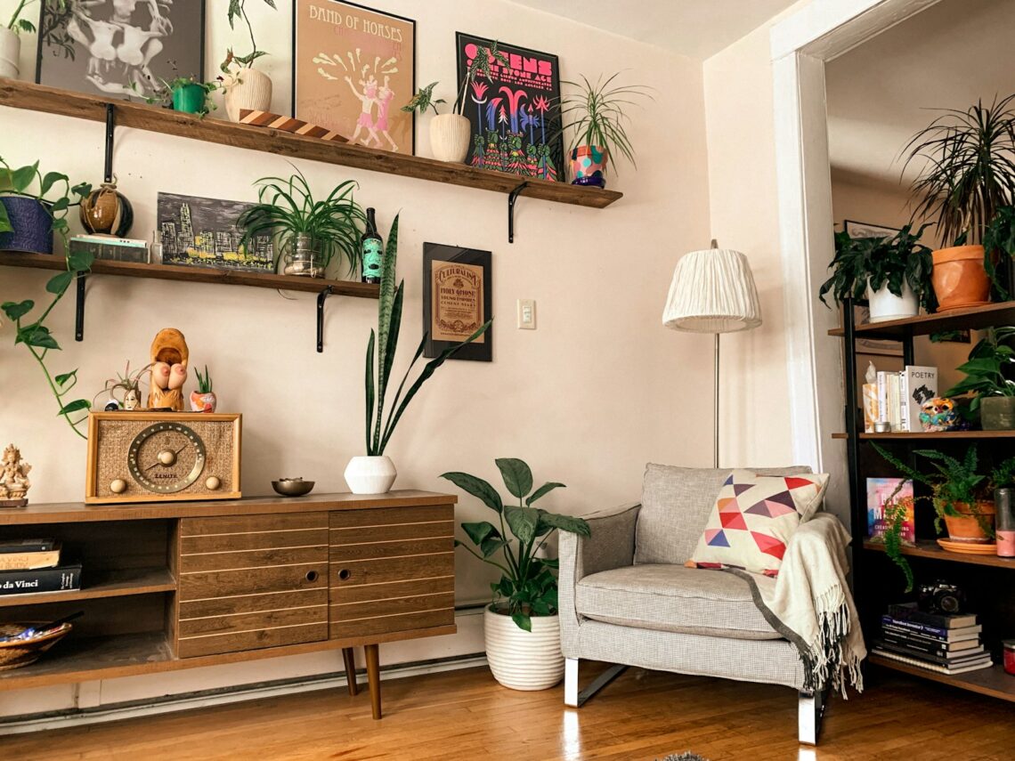
Palettes 7 and 8: Linen and Natural Straw Tones

Linen-toned palettes look especially good when they catch natural light. The key material is, naturally, linen itself: linen curtains filter sunlight into a golden, honeyed color that transforms a room in a way no paint can replicate.
Palette 7: Full Linen and Straw. Think sand, wheat, and pale straw layered together. Benjamin Moore Jute (AF-80) and Sherwin-Williams Straw (SW 6122) are both strong choices for walls. Pair with rattan furniture, cane headboards, woven baskets, and undyed linen curtains. This palette borrows from Japandi and Mediterranean styles at the same time. It works especially well in studio apartments where you want everything to read as one cohesive surface. For more on how this approach works in a studio, see our guide to Japandi style for small apartments.
Palette 8: Warm Sand Plus a Single Bold Accent. Start with a sandy neutral base (walls, sofa, rug) and introduce one strong accent. A mustard yellow chair, a cobalt blue vase, or a deep olive throw will read against the warm sand backdrop without competing with it. The warm base makes even a single bold piece feel curated rather than random.
- Linen curtains in a small apartment are high-impact at low cost: around $30 to $50 a panel at IKEA
- Natural fiber rugs (jute, seagrass, sisal) anchor linen palettes better than synthetic rugs
- Layer texture heavily in this palette since the color range is narrow
Palette 9: Warm White, Done Right

Not all white is the same. Bright cool whites like Benjamin Moore Chantilly Lace read almost blue in certain light conditions, which is the last thing a small apartment needs. Warm whites with a slight yellow or peachy undertone feel much friendlier.
Sherwin-Williams Alabaster (SW 7008) is probably the most recommended warm white for apartment walls. It leans slightly toward cream without fully committing to it. Benjamin Moore Simply White (OC-17) is another popular pick with a touch more warmth than Chantilly Lace. If your landlord painted with a cool white and you cannot repaint, you can shift the perception of the room by adding warm light sources: swap bulbs to 2700K warm white LEDs, add a warm-toned floor lamp, and layer cream and ivory textiles throughout.
- Warm white paint picks: SW Alabaster, BM Simply White, BM White Dove
- Lighting fix: 2700K bulbs throughout the apartment warm up any wall color
- Small wins: a cream linen duvet, a wood side table, and a woven rug pull the palette warm without painting
This kind of rental-friendly approach pairs well with what we cover in making a minimalist apartment feel warm instead of sterile.
Palette 10: Dusty Rose and Blush as a Warm Neutral

At high saturation, pink reads as bold. At low saturation, pink reads as a warm neutral. Dusty rose and muted blush tones sit in the second category. They have enough warmth to feel cozy and enough gray in their undertone to feel sophisticated rather than playful.
This palette works best in a bedroom. A dusty rose or terracotta throw layered over white linen introduces the warmth without committing to a bold paint color. Benjamin Moore Pink Damask (2173-50) and Sherwin-Williams Rosy Outlook (SW 6329) are both muted enough to function as neutrals on a bedroom wall. Pair with warm white linen, a simple wood headboard, and minimal accessories and the result is a room that feels calm and warm at the same time.
- Blush reads as a neutral when its saturation is below 30 percent
- Pair with: warm wood, cream, sand, terracotta, and matte brass
- Avoid: combining dusty rose with cool grays or bright white, which makes it look washed out
Palettes 11 and 12: Amber, Caramel, and Deep Honey

Amber, caramel, and honey tones are the boldest entries on this list, but they are also the most atmospheric. Used in small doses, they transform an apartment in the evening especially, when warm light bounces off amber accents and creates a completely different room than the one that exists in daylight.
Palette 11: Amber Accents on a Light Base. Keep walls and large furniture light (cream or greige) and bring amber in through glass objects, terracotta-adjacent ceramics, and warm bulb lighting. Amber glass vases on a windowsill catch afternoon light in a way that looks like it cost a lot of money and costs almost nothing. Add a string of warm-white fairy lights along a bookshelf for evening atmosphere.
Palette 12: Full Warm Brown Statement. This is the most committed palette on the list. Caramel and honey-toned walls (try Benjamin Moore Caramel Apple 2165-20 or Sherwin-Williams Restrained Gold SW 6129) create a cocooning effect that makes a small apartment feel intentionally intimate rather than just small. Reserve this for a bedroom or a studio alcove area where the depth of color feels like a feature.

- Amber glass objects: thrift stores and TJ Maxx almost always have them for under $10
- Caramel walls work in low-light rooms that standard neutrals make feel dingy
- Use warm brown sparingly in living rooms: as an accent wall rather than all four walls
For more seasonal inspiration on using warm tones year-round, see our article on making your apartment feel cozy in fall and winter.
How to Build Your Own Small Apartment Color Palette Around Warm Neutrals
Picking paint colors is the last step, not the first. Start with what you already own. Pull out your largest furniture pieces and your current rug and look at the undertones. Warm wood, tan leather, and cream upholstery point toward a warm palette. Gray and cool-toned pieces need more intention to warm up.
Use the 60-30-10 rule as a starting framework. Sixty percent of the room goes to your dominant neutral: walls, flooring, and the largest furniture piece. Thirty percent goes to secondary tones: rugs, curtains, and bedding. Ten percent goes to accent colors: pillows, ceramics, art, and plants. In a small apartment, the 10 percent accent layer carries more visual weight than it does in larger spaces because the room is compact, so every object reads clearly.
If you can paint, test your chosen color on a large (at least 12 by 12 inch) piece of cardboard and move it around the room at different times of day. Small apartments often have only one or two light sources, and the same paint color can read completely differently at noon versus 8 PM. Warm neutrals that look perfect in natural light can turn muddy under certain artificial lighting.
- 60 percent: walls and largest furniture piece
- 30 percent: rugs, curtains, and bedding
- 10 percent: decorative objects, pillows, plants, and artwork
- Test paint samples on cardboard at three different times of day
- Start with textiles before committing to paint: they are cheaper and easier to change
The Takeaway
Warm neutral color palettes solve one of the most common small apartment problems: spaces that feel clean but not comfortable. Whether you start with cream and ivory, commit to a greige base, or layer in terracotta accents over a sand foundation, the goal is the same. Your apartment should feel like a place someone lives in and loves, not a blank rental waiting to be filled.
You do not need to paint to make most of these palettes work. Linen curtains, a jute rug, a knit throw in rust or caramel, and warm-white light bulbs will shift most apartments toward a warm neutral palette without your landlord ever knowing you did anything at all.
Related Reading